

Recently, I purchased some train tickets to take me to London so I could attend an important appointment. A very important appointment. Upon booking I had a hunch things may not run smoothly.
Call it a sixth sense or intuition, or maybe just looking at it from a negative view, but I opted to pay for the ‘Payment Protection’ in case something went wrong. This would safeguard me against any loss, keep me smiling and feeling secure. “Nice company” [insert warm inner glow here]. All this for only a few pounds more on top of my ticket price. Surely I couldn’t lose.
Unexpectedly the circumstances around my journey changed, meaning my tickets were now useless to me. No problem I thought, I will just contact the company I purchased the tickets from and work my way through their slick refund process. It’ll all be under one roof and will only take 5 minutes or so. We were going to be O.K, I thought to myself.
I logged into the website I had bought my tickets from, followed the given link and was then directed to another page. After which, I was prompted to follow yet another link. This second link took me off to another company who then told me to contact them via phone or send an email. “Let’s call” I thought. Using the number on their website deemed as a ‘helpline’, I was surprised when this took me to the company’s head office and not to a customer service helpline as advertised.
The somewhat baffled but pleasant head-office worker who answered my call provided me with two more phone numbers to try. Not one clear telephone number, but two ‘to try’! I made my next call. This then trapped me into a nightmare automated ‘press 4 if you feel like you’re losing the will to live’ scenario. By now I was becoming frustrated. I switched tactics. “Let’s email”. In reply to my email I was sent some PDFs. I was instructed to complete, print, scan and return these as soon as possible. I now wasn’t sure if I was sitting an exam or getting a refund. I was making no real progress.
More and more chaos ensued as I was caught in an infinite loop of information and misinformation wandering from one approach to the other in desperation. Like most people these days I made my stance public via social media. “Wolfie” Smith would be proud of me battling out my cause. Had the refund system been under one roof and adopted a systematic, formulaic approach things could have ended much more positively.
With this in mind, what does your company’s website offer in terms of helping customers come away with a positive user experience when it comes to customer service? What steps do you take to prevent them from feeling that the only way they can be noticed and valued is to leave your website and start a rant on Social Media?
The UI/UX Route - Organise and explain your data
User Interface and User Experience remain hot topics and there is a lot to think about. People specialise in UI and UX design. After all it’s a discipline complete with consequences. The question you need to ask yourself is what am I doing to help provide a rich and positive experience for your Web user that will guarantee a good level of customer service?
Place key information in a logical place
Providing good accessibility throughout your website and a logical structure to your information architecture will increase customer loyalty and bolster customer service. One rule to start with is to place the information visitors are looking for in a location where they would expect to find it. Providing a clear way for your users to find your contact details is a must, but after they find this information we can go another step further.
For example, if your business has a phone number in a clear position on each page of your website then tell them what this number is for. This way, you are giving them control. Surely it is better to list any telephone numbers with clear labels than have your user play Red or Black with a number only to hear, “thank you for calling, to speak to … press 1, to speak to …”. A spiral of frustration usually follows the latter approach.
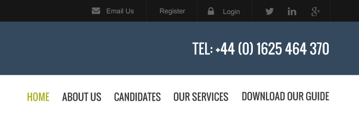
Here is an example of information not enabling a visitor to make an informed choice:
Here is an alternative solution offering more to the end user:
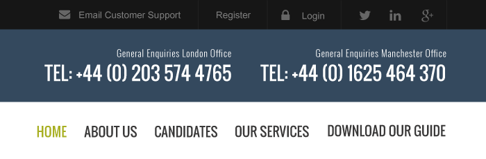
Furthermore, if your company has several departments all with separate contact details, then group and present this information in a clear way to the user in one content area, not fragmented across the site or multiple domains. That may mean creating a beautiful contact page containing all the information people are going to need. Bear in mind, chunking information into logical groups is a method that can be applied site-wide to achieve better results for you and your audience.
Abolish the phrase ‘Click Here’ and give your user an informed choice
Do not under any circumstances simply label call to actions as ‘Click here’. Besides the fact that I have never met anyone yet who has really ‘clicked’ on a mobile device. (They have ‘tapped’ even ‘dragged’ but I have never heard a click) it tells the user nothing about the content or what will happen should they follow the link. Instead, offer them more. Think about your choice of verbs and the nouns. For example why not use, ‘Download Our Free Map’ or ‘Complete Our Customer Complaints Form’. This way users know more about what they are getting and where they will be getting it from.

Guide your user and provide a clear end goal
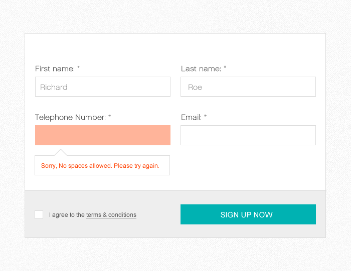
Once users are on a path they should be guided along seamlessly, each step of the way, ensuring they reach their end goal in glory. Forms can often be a sticking point. For example, filling in a registration form that catapults you back to the top of the page, like an angry mum grabbing you by the ear and dragging you along because you have been naughty, is not good. After all, all you did was add a few spaces in your formatting.
Simply applying inline form validation takes the sting out. Inline validation means that if you fill a form field in a way that the form didn’t expect, you get an instant message near the form field, prompting you to try again. Most times this comes with a snippet of advice and maybe a tut-tut from your browser. On many occasions I have pressed the Submit or Send button on a form only to be thrown around the page making me search for or decipher where I went wrong. This often results in me being creative with my formatting until I crack their enigma code.
Let the navigation do the talking
Does your navigation makes logical sense and work across devices? Navigation on smaller devices can present its own challenges. That mega menu on your website, which is stunning on desktop, may be absolute pants on mobile. Do not underestimate the knowledge of a good front-end Web developer who can help make your website responsive and mobile friendly. Ensuring people navigate to what they are looking for is key to keeping them happy and calm.
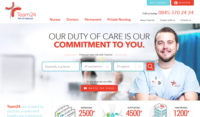
When Team24, a nationwide healthcare agency and all round nice guys, came to us for their new website, we worked with them to build a website that not only looks great but delivers an excellent user experience. We based our navigation around the clear presentation of information, even for those browsing on mobile and other smaller devices.
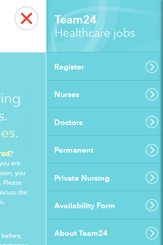
Want to check out the navigation for yourself? Head to the Team24 website. Did you see that? I didn’t have to write click here. It’s really that simple!
Think about what you do need and don’t need in your navigation. If it doesn’t have to be there take it out. Clean and simple is best. Remember, UI/UX isn’t just thrown together. People often come to me and say things like, “can I add more links” or, “can we add some more buttons and change the content around again”. Sometimes this is fine. Sometimes I feel like a car mechanic being asked to fit a Ferrari engine into a tricycle. Duct Tape does a good job and I did actually try Arc Welding in my art college days, but there comes a point you have to say “if you want to do this you have to go back and rebuild it properly in order to make it work as it should”. Determining what’s included in your navigation at the planning stage is important.
Add a Progress Bar to Guide Your User
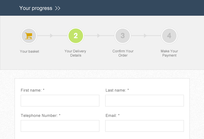
This simple but effective approach means that visitors to your website know where they are in the chain of events. They can choose to go back if they have missed something and know what they have to do in order to get to the next stage. Importantly they can see the end goal as you are providing a clear and defined end point. Adding this breadcrumb trail shows that you care how your customers are treated and that you are prepared to be open about the steps they need take.
There are many steps you can take to ensure your website not only looks great but also functions well to its audience. Ultimately, if you need to reinvest in a quality re-design to make improvements, do so openly. If it is done right, by a team that know their HTML onions, your audience will soon be wagging their tongue and your conversion rates will be higher than ever before.