
Design has evolved over the years to keep up with trends, devices and user experiences. All in all, web design is used to communicate important messages and guide user journeys. There are many principles and theories that drive website designs, the most common and some would argue the most important being, Visual Hierarchy.
You may not have heard of it before, but visual hierarchy is a fundamental part of website design. From your site navigation to the call to action and forms, visual hierarchy plays a role in every aspect of your recruitment website design to steer candidates towards application and clients towards enquiry.
In this blog, we’re taking a closer look at the core principles of visual hierarchy and how they play a part in website design for recruitment.
What is visual hierarchy, and why is it important?
Visual hierarchy is one of the leading design fundamentals we use daily to create impactful and effective recruitment websites. In simple terms, visual hierarchy is ordering elements within a design to help convey the levels of importance of the information on display. In addition, we are giving visual cues to help guide a candidate or client through the design and subtle hints on navigating the information being shown.
By guiding the user through the information, we can help convey the message correctly and assist users in achieving the task they have set out to do. Without visual hierarchy, it is difficult to know where to look, where to begin and where to go next.
Poorly thought-out designs can leave the user feeling overwhelmed, confused, or even frustrated. So it’s our job as designers to apply strategy and logic through a few core design principles that give the website visitor the best experience. From this, we aim to encourage them to interact with your recruitment site, whether that be through uploading a CV, applying for a role, uploading a vacancy, or even just getting in touch through a contact form.
We have all done it, landed on a website, only to leave within a few seconds. What could the designer have done differently in these situations to convince the user they were in the right place? We can change a confusing layout into a useful and engaging website design with a few simple adjustments.
Visual hierarchy is used across graphic design, social media and web design, but plays a vital role in the world of recruitment. We utilise these principles for career and recruitment agency websites to guide candidate behaviour backed by strategy. For example, say the aim of the site is to get more CV uploads or applications. Knowing this, we’ll take colour, positioning and contrast elements to ensure the CTA and candidate information is clear and accessible.
The 3 core principles of visual hierarchy
There are many ways to apply visual hierarchy to a design, but a few key methods stand out. Below are the 3 core principles that are the most important when designing a recruitment site. These elements should be the foundations of your designs as they work to get the user's attention, direct their eyes and guide them through a tailored journey.
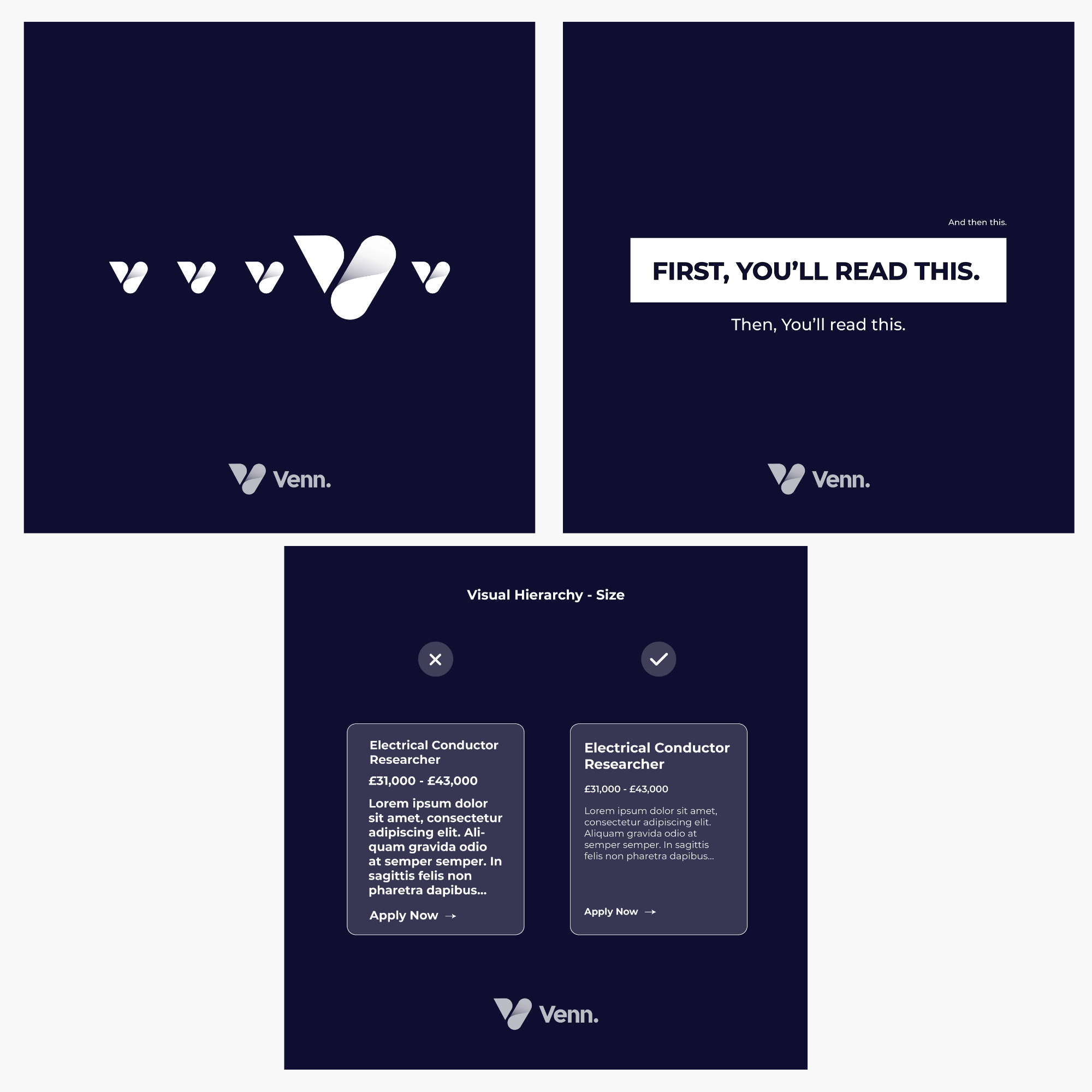
1. Using size and scale to grab the user’s attention
Imagine a road with 4 cars on it; they are all the same and nothing unique to make one stand out over the other. Now replace one of those cars with a tractor. Where is your eye going first?
Bit of an odd example, but I think you get the point.
By manipulating the proportions of different elements, we can very quickly give a design structure that leads the user from one area to another. The larger the section, the higher its importance. So by defining different sizes for different areas, you are telling the user where to go.
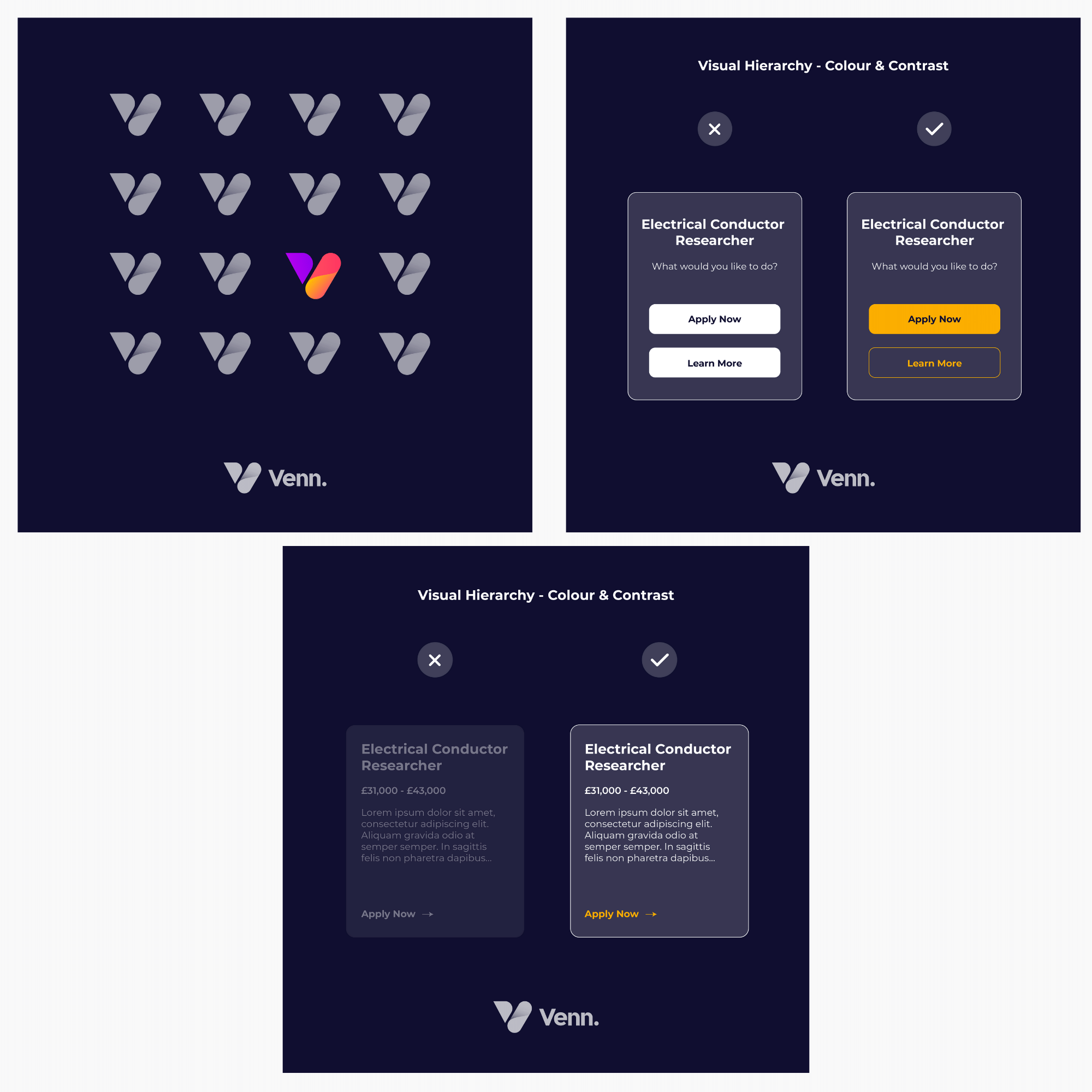
2. Using colour and contrast to help objects stand out
Colours, when used correctly, can have the same impact as size and weight. Brighter, more vibrant colours will usually grab the user’s attention much more than non-saturated, faded colours.
This doesn’t necessarily mean you should pick the strongest, most powerful, eye-watering hues, but when adding colours, do it with purpose and think about how it sits within the surrounding elements.
Contrast also plays a considerable part in accessibility. Text colours should always have enough contrast from the background to ensure legibility. If a user is hard of sight, they may struggle to read text that blends into the background. Colour contrast is used frequently for calls to action and buttons as we try to guide the user through a particular journey through the website to a defining action.
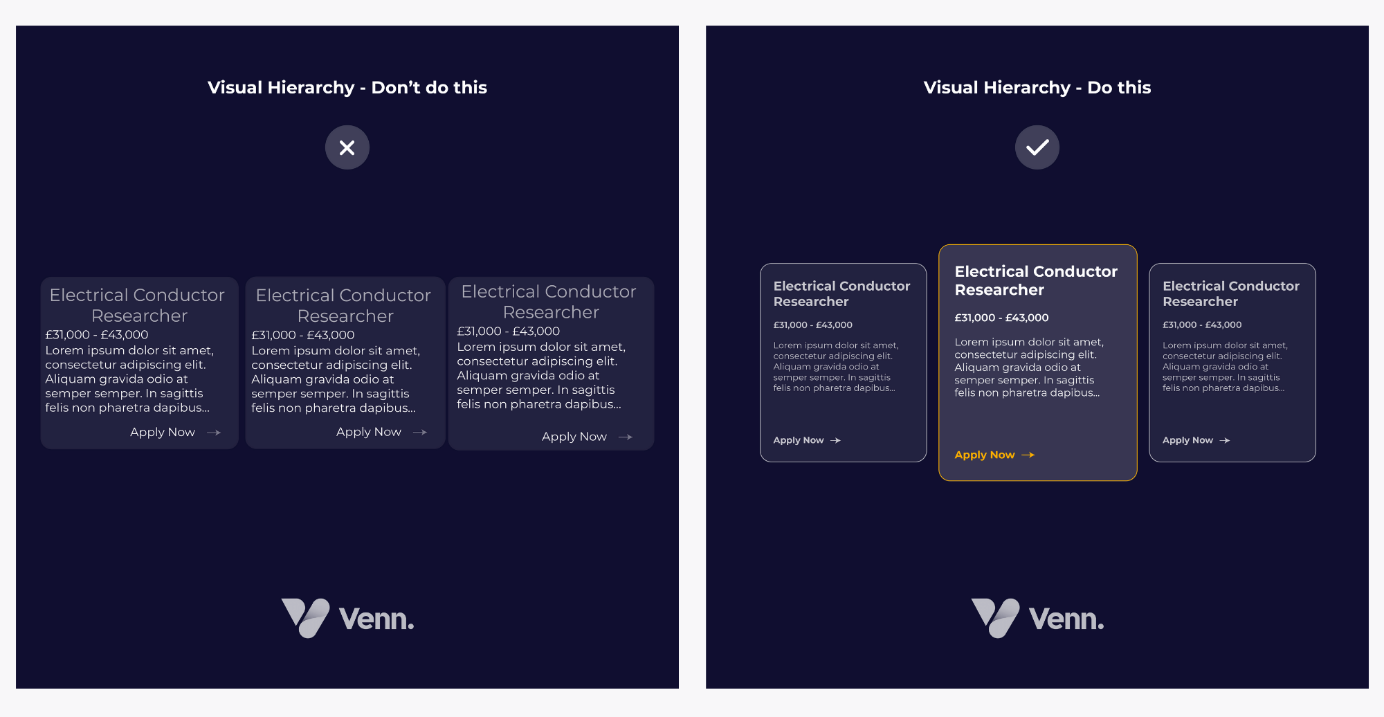
3. Positioning, spacing and proximity
These 3 components, when used incorrectly, can destroy a design instantly.
Positioning/alignment can help you organise the elements on a page to make it much easier for a user to detect the key information in a design whilst improving the readability and flow.
Spacing is when we intentionally let our designs breathe. It is always the go-to move to see an empty space and think, “what can I put there?”. Quite often, the correct answer is nothing!
If you are trying to find any old piece of information to fit in a gap, there is a good chance it is not needed to enhance the outcome. A cramped design can make it incredibly difficult for a user to navigate naturally from one section to another whilst also creating an uncomfortable atmosphere on the page. By adding space between elements, we are making it easier for our users to identify each individual element and absorb the information.
As much as we like to think that every visitor to our recruitment website will read every word, most users will skim read, glance over images, and scroll to an area that grabs their attention. By adding space, we can create clear definitions between sections, allowing the user to understand the site's structure without pausing on every block. “White space” or “blank space” naturally leads to focus.
Proximity is one of the basic graphic design principles. In a nutshell, things that are related to each other should be near each other, and if they are not related, move them away from each other. This sounds obvious, but when we have a lot of information on a page, we can quickly fall into the trap of creating unwanted groupings, misleading connections, and disruptive patterns.
We, as humans, naturally try to create connections and patterns as it helps us make sense of information. So when we add similar alignment to objects along the same path, we automatically make them feel associated with one another. When we group, align and organise elements using these rules, scanning content becomes more natural to the user, increasing the chance of higher engagement.
How can you incorporate these visual hierarchy principles into your recruitment Website Design?
When starting your design, whether for a full page or just a call to action, take a moment to order your content by its level of importance. If you have a strong understanding of which information sits above another in the hierarchy, 50% of the job is done.
You can now use these simple design tools to bring the design to life, guide your user and create engaging content that your users will feel comfortable interacting with.
In website design for recruitment, less is more. So keep it simple, and have a plan. At this stage, one of the biggest battles is thinking, “Well, it’s all important!”. Yes, it may well be, but at this stage, you should zoom out on the entire project and ask yourself, “If a user were to come to this website and do just one thing, what would you want it to be?”
If you can determine the desired outcome, you can determine the flow and the steps they will need to take to get there. Step one is to find the goal; step two is to paint the target.
Does your site meet the laws of Visual Hierarchy?
Designing a website is about putting your users first. Take a step back and think, ‘what is the goal of this website and what do I want the user to do?’. Once we know this, it’s our job as designers to utilise design elements and bring it to life.
Visual Hierarchy is a design tool and the secret to creating enjoyable experiences, using your website as the medium. These principles consider everything from colours to page positioning and, when used correctly, deliver designs that are yards ahead of the competition, offering a unique and customised UX.
We constantly evolve our designs and challenge the norm to create beautiful user-first recruitment website designs. Working closely with agency brands, we can understand what they are trying to achieve and design concepts that target their unique customers. So if you’re looking to upgrade your site, discover more about our approach to recruitment website design or speak to one of our experts today.